

So these are some photos of the art direction project I mentioned earlier, in collaboration with
Alice. They're not entirely finished and given the feedback we got in the crit we might adjust them a bit and re print them next term.
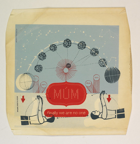
So the idea behind the album was to look at closely t imagery associated with the music. The main themes we focused on were light/dark and dreaming and landscapes. The album is by an icelandic band so that gave us a lot of imagery to work with.
the top image is of the cover for the 12" record sleeve. We used the idea of a dreamscape, something that looks familiar but is a little bit odd. The constellations as they are seen from iceland in the winter months is printed behind the mountains. The two round htings at the bottom are diagrams of eyes, we looked a lot at dream interpretation and found that in some schools of thought, the left eye is said to represent the moon and the right eye to represent the sun , which tied in nicely with our imagery. The lines on the eyes are from these diagrams used to predicat the future based on how certain planets and stars are aligned on a certain day.
The second image shows one of our earlier trials, printed on the inner sleeve of an old LP. We might pursue this idea of using recycled materials further.
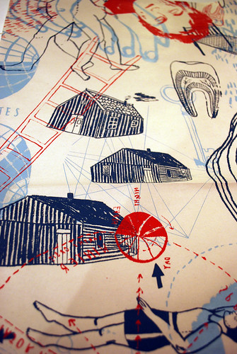
The third image shows one of the screen printed posters that would come with the album. As the outside is quite rigid and symmetrical, we wanted the inside to be a bit more random, tying in with the imagery of dream interpretation. All of the images are derived from interpretation of lyrics and our own dreams in the duration of the project (for example, if you dream of teeth it means you are under stress, something we felt appropriate!). All of the posters are unique 3 layer screen prints. The random placement of the paper under the screen means that no two should be identical.
The final image is a re-do of the logo, I wasn't too keen on the block of red used in the original and this was just an experiment to see what it might look like with another colour scheme.
The other main point of our work was to play with the ideas of light and dark. We designed some layers to be screen printed over the top of the original cover in glow in the dark ink. This would also be printed on the posters and all other merchandise. The idea is that in the dark, if you happen to look at it in the dark (or if the poster is on your wall) it will reveal another 'secret' set of images. We ran out of time in the end and didn't print this on the covers, but experiments showed that it'll look pretty cool when it does. It's barely visible in light, it kind of looks like a varnish.
Another idea, in contrast to the glow in the dark idea, was to have holes punched on parts of the cover to allow light to shine through. Another possible implication of this would be to allow the owner of the album to stitch into the holes. We'll see how it goes!
Very pleased with this project. It was a lot of hard work and it will be more hard work to get it finished but it was all worth it.


